

25.7617° N, 80.1918° W
NOISE-COLD BREW
BRANDING
/
STRATEGY
/
(
©2023
)
Scroll Down

Overview
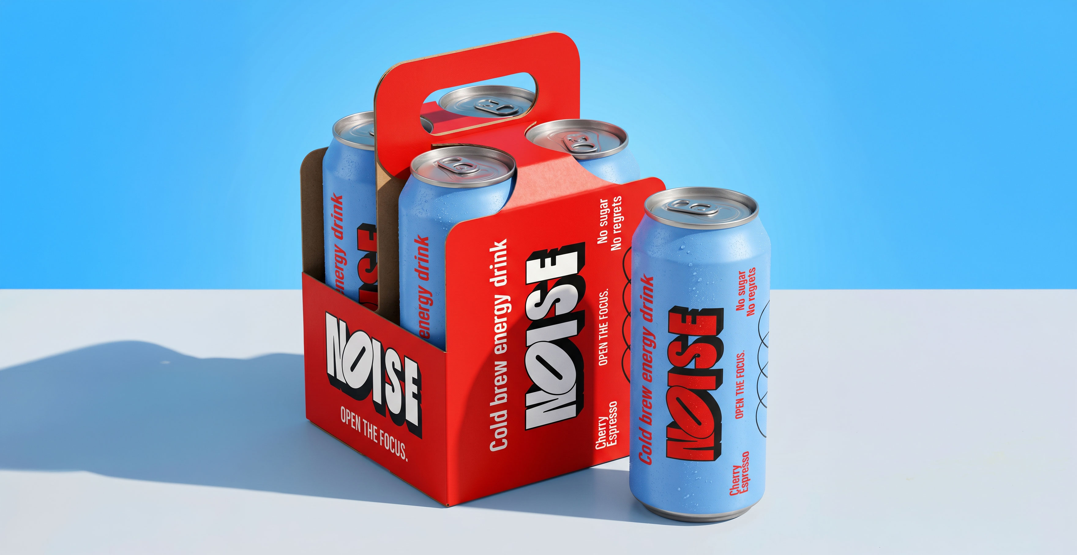
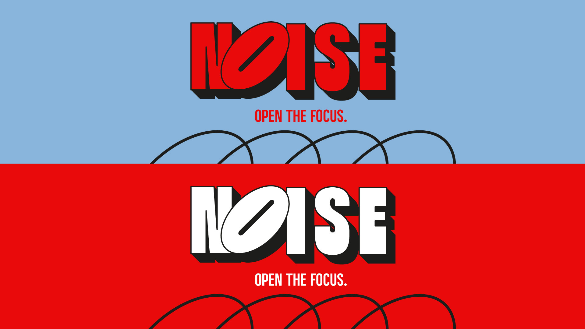
NOISE was built around the idea that focus has become a luxury. In a category dominated by chaos, aggression, and visual overstimulation, the brand takes a more intentional approach, using open space, architectural typography, and controlled color tension to reframe energy as clarity. Every element, from the engineered logo system to the sky-driven art direction, was designed to position NOISE not as an energy drink, but as a cultural object for a generation living in constant mental noise.
Year
©2023
Project
NOISE-COLD BREW




No items found.
Related Projects
(#)





HELLO ALL OF US
CREATIVE STUDIO

